Image 1 of 1: ‘Blank plot, before adding any mapping aesthetics to ggplot().’

Image 1 of 1: ‘Plotting area with axes for a scatter plot of life expectancy vs GDP, with no data points visible.’
Image 1 of 1: ‘Scatter plot of life expectancy vs GDP per capita, now showing the data points.’
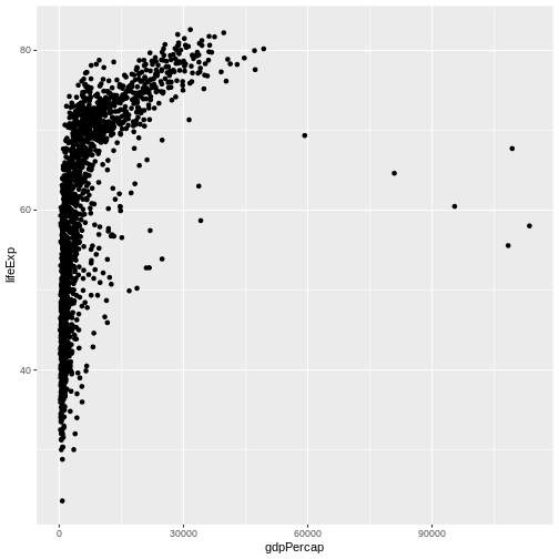

Image 1 of 1: ‘Scatterplot of GDP vs life expectancy showing logarithmic x-axis data spread’
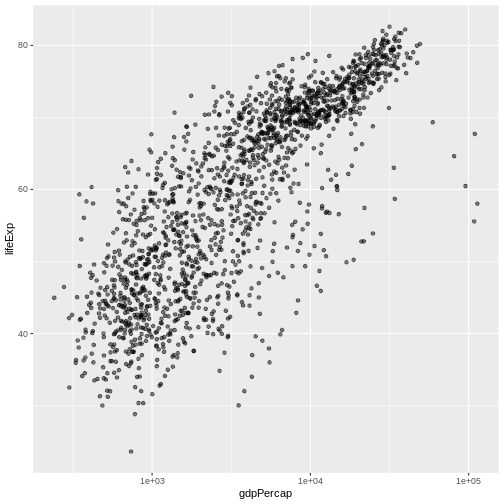 Scatterplot of GDP vs life expectancy showing logarithmic x-axis data
spread
Scatterplot of GDP vs life expectancy showing logarithmic x-axis data
spread