Content from Creating Publication-Quality Graphics with ggplot2
Last updated on 2024-05-14 | Edit this page
Overview
Questions
- How can I create publication-quality graphics in R?
Objectives
- Learn how to use the {ggplot2} package to generate publication-quality graphics.
- Manipulate the aesthetics of a plot using different colors, shapes, and lines.
Plotting our data is one of the best ways to quickly explore it and the various relationships between variables.
Today we’ll be learning about the ggplot2 package, built on the
grammar of graphics:
- data set,
- mapping aesthetics,
- graphical layers
Let’s start off building an example using the gapminder
data from earlier.
R
library("ggplot2")
ggplot(data = gapminder)

Now we’re going to add in the mapping aesthetics
using the aes function. aes tells
ggplot how variables in the data map to
aesthetic properties of the figure, such as which columns of
the data should be used for the x and
y locations.
R
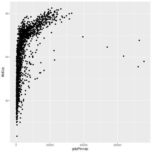
ggplot(data = gapminder,
       mapping = aes(x = gdpPercap, y = lifeExp))
The final part of making our plot is to tell ggplot how
we want to visually represent the data. We do this by adding a new
layer to the plot using one of the
geom functions.
R
ggplot(data = gapminder,
       mapping = aes(x = gdpPercap, y = lifeExp)) +
  geom_point()
Modify the example so that the figure shows how life expectancy has changed over time:
R
ggplot(data = gapminder,
       mapping = aes(x = gdpPercap, y = lifeExp, color=continent)) +
  geom_point()

Layers
Using a scatterplot probably isn’t the best for visualizing change
over time. Instead, let’s tell ggplot to visualize the data
as a line plot:
R
ggplot(data = gapminder,
       mapping = aes(x=year, y=lifeExp, group=country,color=continent)) +
  geom_line()+
  geom_point()
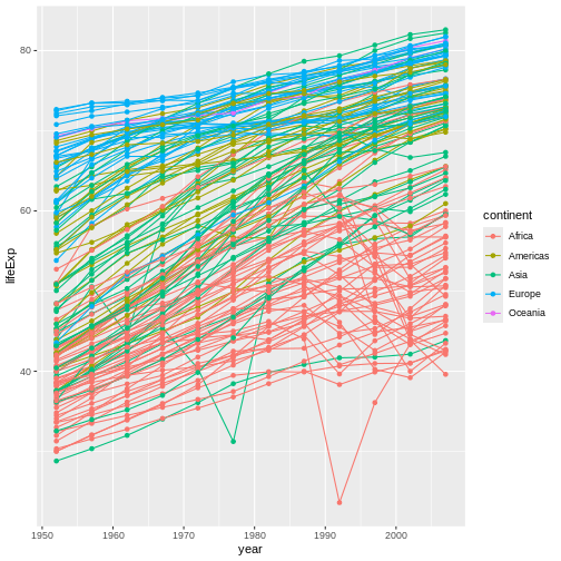
In this example, the aesthetic mapping of
color has been moved from the global plot options in
ggplot to the geom_line layer so it no longer
applies to the points. Now we can clearly see that the points are drawn
on top of the lines.
Tip: Setting an aesthetic to a value instead of a mapping
So far, we’ve seen how to use an aesthetic (such as
color) as a mapping to a variable in the data.
For example, when we use
geom_line(mapping = aes(color=continent)), ggplot will give
a different color to each continent. But what if we want to change the
color of all lines to blue? You may think that
geom_line(mapping = aes(color="blue")) should work, but it
doesn’t. Since we don’t want to create a mapping to a specific variable,
we can move the color specification outside of the aes()
function, like this: geom_line(color="blue").
Transformations and statistics
ggplot2 also makes it easy to overlay statistical models over the data. To demonstrate we’ll go back to our first example:
Currently it’s hard to see the relationship between the points due to some strong outliers in GDP per capita. We can change the scale of units on the x axis using the scale functions. These control the mapping between the data values and visual values of an aesthetic. We can also modify the transparency of the points, using the alpha function, which is especially helpful when you have a large amount of data which is very clustered.
R
ggplot(data = gapminder, mapping = aes(x = gdpPercap, y = lifeExp)) +
  geom_point(alpha = 0.5) + scale_x_log10()
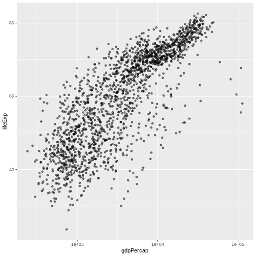
The scale_x_log10 function applied a transformation to
the coordinate system of the plot, so that each multiple of 10 is evenly
spaced from left to right. For example, a GDP per capita of 1,000 is the
same horizontal distance away from a value of 10,000 as the 10,000 value
is from 100,000. This helps to visualize the spread of the data along
the x-axis.
Tip Reminder: Setting an aesthetic to a value instead of a mapping
Notice that we used geom_point(alpha = 0.5). As the
previous tip mentioned, using a setting outside of the
aes() function will cause this value to be used for all
points, which is what we want in this case. But just like any other
aesthetic setting, alpha can also be mapped to a variable in
the data. For example, we can give a different transparency to each
continent with
geom_point(mapping = aes(alpha = continent)).