library(tidyverse)
library(hmsidwR)
library(sf)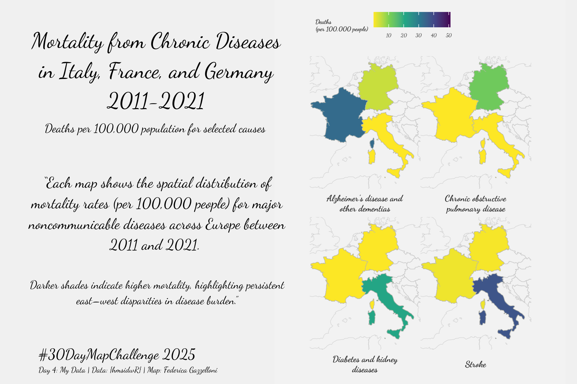
Overview
Data for this challenge comes from the {hmsidwR} package, which includes global polygon data for mapping disease burden (DALYs) worldwide and other health metrics.
Load Libraries and Data
data(idDALY_map_data)
data(deaths9)
To gain more info about the data:
?idDALY_map_data
?deaths9
deaths <- deaths9 %>%
filter(sex=="both") %>%
select(location,cause,dx)
deaths %>%headCombine Datasets by location
geometry <- idDALY_map_data  %>%
  select(location_name, geometry)
deaths_map_data <- deaths %>%
inner_join(geometry,
by = c("location" = "location_name"))
deaths_map_data %>% count(cause)CamCorder and ShowText
# library(camcorder)
# camcorder::gg_record(width = 6, height = 4)
# Colours
text_col <- "grey10"
bg_col <- "grey95"# Fonts from Google Fonts
# library(showtext)
# font_add_google("Metal Mania")
# font_add_google("Dancing Script")
# showtext_auto()
# showtext_opts(dpi = 300)
# title_font <- "Metal Mania"
# body_font <- "Dancing Script"base_map <- idDALY_map_data %>%
ggplot() +
# Base map layer
geom_sf(fill = NA,
color = alpha("grey70", 0.4),
linewidth = 0.2) +
# Disease-specific data layer
geom_sf(data = deaths_map_data %>%
filter(cause %in% c("Alzheimer's disease and other dementias",
"Chronic obstructive pulmonary disease",
"Diabetes and kidney diseases",
"Stroke")),
aes(fill = dx, geometry = geometry),
color = alpha("grey70", 0.4),
linewidth = 0.2) +
# Coordinate limits (Europe focus)
coord_sf(xlim = c(-5, 20),
ylim = c(35, 56),
expand = FALSE)
base_mapfacet_legend_map <- base_map +
# Facets for each disease
facet_wrap(~cause,
labeller = label_wrap_gen(width = 25),
strip.position = "bottom") +
ggthemes::theme_map() +
theme(legend.position = "top",
legend.key.size = unit(0.8, "lines"),
legend.title = element_text(size = 5, face="bold"),
legend.text = element_text(size = 4),
legend.background = element_rect(fill = NA,colour = NA))
facet_legend_mapcolored_map <- facet_legend_map +
# Color scale and legend
scale_fill_viridis_c(name = "Deaths\n(per 100,000 people)",
labels = scales::label_number(scale = 1e-3),
option = "D", direction = -1) +
theme(text = element_text(family = body_font,
size = 9,
color = text_col),
strip.text = element_text(size = 7, face = "bold"),
strip.background = element_rect(fill = NA, color = NA))
colored_mapragg::agg_png("day4_my_data3.png",
width = 6, height = 4,
units = "in",
res = 320,
bg = bg_col)
colored_map
dev.off()