library(tidyverse)
library(readxl)
library(sf)
library(rnaturalearth)
library(openxlsx)
Overview
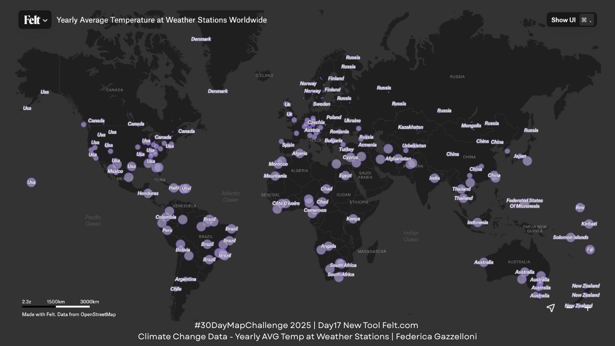
For today’s “New Tool” theme, I explored https://felt.com/, an intuitive browser-based mapping platform. Before creating the final map in Felt, I prepared the dataset entirely in R. Below is the full workflow you can use to reproduce the data cleaning, temperature aggregation, and spatial preparation steps.
This project combines two datasets—from weather stations and their yearly temperature records—to build a clean, spatially ready table for mapping. The final dataset includes station location, elevation, country information, and average temperature, which is then exported and uploaded to Felt.com for fast visualization.
Loading and inspecting raw data
We use {tidyverse} for wrangling, {readxl} to import the Excel exam dataset, {sf} for spatial structure (when previewing maps), {rnaturalearth}, and {openxlsx} to save the file.
Import the Weather Station Raw Data
The first Excel sheet contains station locations and basic metadata. The dataset comes with checks against expected ranges. Before any spatial work, we inspect these variables and drop invalid or missing values.
stations_raw <- read_excel("data/09_2023-1_model-solution.xlsx",sheet = 1)
head(stations_raw)names(data_raw) <- data_raw[1,]
data <- data_raw[-1,]Clean Variable Names & Filter Valid Stations
We use janitor::clean_names() to standardize columns. Then we keep only rows where all quality checks are marked “Ok”. Coordinates and elevation are converted to numeric fields, while country/continent names are standardized to title case. Stations below sea level are removed for consistency. This results in a reliable set of station points.
elev_data <- data %>%
  janitor::clean_names() %>%
  filter(check_versus_expected_range=="Ok",
         check_versus_expected_range_2=="Ok",
         check_versus_expected_range_3=="Ok") %>%
  select(id,latitude,longitude,elevation,country,continent)%>%
  drop_na() %>%
  mutate(latitude =as.numeric(latitude),
         longitude =as.numeric(longitude),
         elevation =as.numeric(elevation),
         country=str_to_title(country),
         continent=str_to_title(continent))%>%
  filter(elevation>=0)

elev_data%>%summary()
Import Temperature Data
This data contain monthly temperatures for each station and each year. We reshape the data from wide to long format, calculate average yearly temperature per station, then average again across years to obtain a long-term mean temperature.
temperature_raw <- read_excel("data/09_2023-1_model-solution.xlsx",sheet = 3)
head(temperature_raw)
temperature <- temperature_raw %>%
janitor::clean_names() %>%
select(1:14) %>%
pivot_longer(cols = -c(id,year),
names_to = "month",values_to = "temp")%>%
group_by(id,year)%>%
reframe(avg_yr_temp=mean(temp))%>%
group_by(id)%>%
reframe(avg_tem=round(mean(avg_yr_temp),3))
temperatureJoin Temperature and Elevation Data
We link the elevation dataset and the temperature dataset by station id, creating a unified table called climate_data. This includes:
- latitude / longitude
- elevation
- country, continent
- long-term yearly average temperature
climate_data <- elev_data%>%
inner_join(temperature,by="id")climate_data%>%summary()This is the dataset exported to climate_data.xlsx.
Export the Final Data
The cleaned table is saved using openxlsx::write.xlsx(). This file is then uploaded to Felt.com, which automatically recognizes coordinates and places points on the map.
openxlsx::write.xlsx(climate_data, file = "data/climate_data.xlsx")Preview Map in R (Optional)
To check the dataset before exporting, we create two quick visual checks:
- A simple map using map_data
world <- map_data("world")ggplot(climate_data)+
geom_map(map = world,
aes(map_id=country,
fill= avg_tem))+
expand_limits(x = world$long, y = world$lat)- A more modern visualization using Natural Earth boundaries (
{rnaturalearth})
world <- rnaturalearth::ne_countries(returnclass = "sf",
                                     scale = "medium")%>%
  filter(!name=="Antarctica")
These previews allow us to confirm that:
- all stations plot correctly
- temperature values behave as expected
- no impossible coordinates remain
ggplot(climate_data)+
  geom_sf(data = world,
          aes(fill=name),
          alpha=0.5,
          show.legend = F,
          inherit.aes = F) +
  geom_point(aes(x=longitude,y=latitude,
                 color=avg_tem,size=avg_tem),
          shape=21,stroke=0.5,
          fill=alpha("black",0.5),
          show.legend = F)+
  scale_color_gradient(low="white",high="red")
Using the Data in Felt.com
Once uploaded to Felt:
- You can style points by temperature
- Add elevation as labels or filters
- Apply basemaps and annotations
- Combine layers or create a shareable URL
Check the map: https://felt.com/map/Yearly-Average-Temperature-at-Weather-Stations-Worldwide-EejSJfISQgmRw9CUMN9Ab59BD?share=1&loc=27.62,7.9,2.35z