ggplot(world_proj) +
  geom_sf(aes(fill = popproj2125)) +
  scale_fill_gradient(
    low = "#a3c9c4", high = "black",
    name = "Population (Millions)",
    labels = scales::label_number(scale = 1e-3, suffix = "M")
  ) +
  coord_sf(crs = "+proj=eqearth") +
  ggthemes::theme_map() +
  labs(title = "Projected World Population in 2125")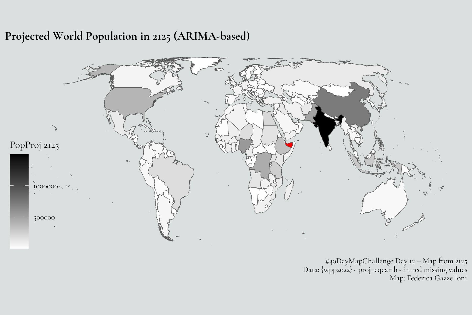
Overview
Today’s map imagines what the world’s population might look like a century from now. Using UN World Population Prospects data (extended from 2100 projections), I forecasted populations to 2125 with a simple ARIMA time series model — not to predict the future precisely, but to visualize long-term demographic momentum.
To display these results fairly, I used the Equal Earth projection, an equal-area map designed to represent every country proportionally to its real size. Unlike Mercator or Robinson projections, Equal Earth preserves area relationships — crucial when mapping population density or total population.
Here’s a minimal example of the R code:
🗺️ The result: a world reshaped by demographic trends — with continued growth in Africa and South Asia, and steady declines in parts of Europe.